|
|
Post by Xaviera Spirit Evolution on Nov 23, 2008 5:16:26 GMT -5
Alright, so for the last 48 hours, I've been working on two caws. Misae Sunohara and Gabriel. Now, I like Gabriel. I just don't know if I'll keep his morphing. Mainly because...well, I'll just show you. XD 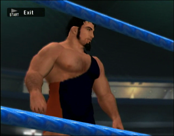 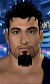 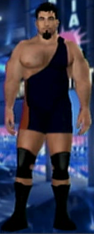  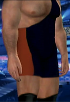  COMPLETELY UNREALISTIC BODY MORPHING. I hid the real Ri in the back, she's tied up, mumbling fake curses at me for ruining her reputation. Seriously though, I kind of like it. >_>; Though, I'm not sure if I'll keep his morphing that way. It depends on if you guys like it or not. Really.  Entrance Video. >_>; Then there's Misae Sunohara. While I love her face morphing, (probably my most favorite in the while,) I'm unsure concerning her attire. I plan on role-playing her for the upcoming CWE Women's Division, 'cause yeah...>_>; Eddy Introspect is fun, I just want another character. XD;;  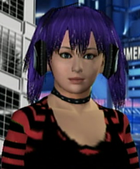  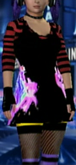  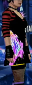  I love/hate the attire. I liked it when I first made it, then I woke up the following afternoon and disliked it. Greatly. XD; I don't want to delete it though, because, well, It's kind of cool looking. I need suggestions on what I can possibly do to make it better? Keep in mind, I can't add anything without deleting something because all 32 of my layers are gone.  Entrance Video. (I made a huge typo as you can see in the preview picture. XD;) Then, last: 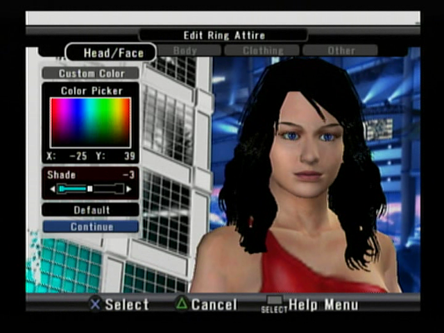 WHOA IT'S BOSTON*'S FACE. Not finished, at all. XD; Just something I whipped up the other morning when I didn't feel like messing with these two up there. Her attire is her SVR07 attire until I think of something. Erm... ^ This attire. XD; |
|
|
|
Post by Kimberly Masters on Nov 23, 2008 5:57:01 GMT -5
Not sure but Gabriel looks good ... he reminds me of big show body wise ...so i think maybe try to get in this direction if he is a big guy.
For the attire ... it looks fine just the really flashy designs on the side of the shirt are a bit too much i think.
|
|
|
|
Post by Xaviera Spirit Evolution on Nov 23, 2008 5:58:50 GMT -5
XD; He's my 7'2 jobber who loses to all the little girls on my card. Literally.
|
|
|
|
Post by Yoshi Nagata on Nov 23, 2008 6:00:14 GMT -5
Suggestions on Gabriel.... Add to the height of the chest and maybe expand the width a tad. Depth is however you want it. If you want him Gigantic it, puff his chest out by increasing depth. umm... Abs seem a tad too long, but it could just be the singlet messing with my perception but if that is the case, decrease the height of that and maybe decrease the width a little as well.. Going by real people perspective here, there's a guy where I wrestle where his chest is more in width than his abdomen... could have just said: See Triple H also though. Maybe bring the width of the shoulders inwards (decrease) so they are closer to his body. Not unless you want his arms apart from his body. Also, tis a minor detail, but maybe expand the width on his hands so they don't look glued to his forearms perhaps? That's about all I can see. o.o; Hope I'm of some help. Also, while i don't have any suggestions for Misea... When I first glanced at the design on her skirt (I think its on the skirt) it looked like the FFX logo. XD Which is not a bad thing at all.  |
|
|
|
Post by robin on Nov 23, 2008 6:59:57 GMT -5
Misea keep it as is, I like that look for her.  Gabriel I'd probably make his abdomen and waist larger or his chest smaller, so if he is supposed to be a jobber you can say he is slow and the little girls just run rings around him  |
|
|
|
Post by wlj on Nov 23, 2008 7:34:23 GMT -5
Just a question what is Gabriel's body type set at? I would put it around the 20 or 30 mark the + way.  |
|
|
|
Post by pakinamac on Nov 23, 2008 12:15:53 GMT -5
Misae looks pretty cool. I like the way that she's looking. She looks like she could be Nattie's sister for some reason. lol XD
Gabriel looks pretty good. I'd go with the suggestions above to improve his body.
|
|
|
|
Post by Amanda Wallace on Nov 23, 2008 12:37:20 GMT -5
The middle chick sort of looks like that xinchao or whatever her name is from tekken five, the cutesy little japanese girl. I'd keep that attire and just have her japanime freak about everything.
|
|
|
|
Post by William James on Nov 23, 2008 13:01:58 GMT -5
Misae looks good, happy to welcome her into the CWE.  Attire wise, maybe make the shirt pink or purple instead of red (with the same design), to match the design on her shorts/skirt. And make the yellow pants, maybe white? Don't change the face at all, that is very good. That is what I would do with her, anyway. Still looks good either way.  |
|
|
|
Post by "Simply Sexy" Chris Calloway on Nov 23, 2008 14:00:24 GMT -5
Gabriel's abdomen should be way wider, he looks like he's holding his breath, and you should give him a meaner look, unless you are going for the gentle giant gimmick
|
|
|
|
Post by Xaviera Spirit Evolution on Nov 23, 2008 21:31:38 GMT -5
I'm going for more of a gentle giant look, hence why I didn't use any of the mean style of eyebrows (that, and those were the darkest of the entire bunch that I liked.) As suggested, I made his chest height higher, as well as added width to his abdomen. I made his hands a little wider, while making them a little shorter. The length they were began to bother me when I got home today. I decreased the width of his shoulders, so his body morphing looks a little more realistic. Still superheroic-y, but not so obvious that, as before mentioned, "looks like he's holding his breath." XD;
His body type was at "0" but now it's "-15"
I haven't touched Misae today yet, but I plan to tonight, once I feel like getting into the game again.
I'll take some screens of Gabriel's updating body morphing tonight as well, and post them then. *Would right now, but doesn't really feel like getting off the bed at the moment*
Thanks for the help everyone. =) Much appreciated.
EDIT:
The reason I called him a jobber, was because he loses in just about every sim I put him in when he's against a female competitor. XD; He has yet to beat a female character, but has at least one victory over each of my male ones. I've been working on his moveset, and he seems to be doing better now, but....yeah. It's kind of DDT-ish. XD;
|
|
|
|
Post by Xaviera Spirit Evolution on Nov 24, 2008 4:01:56 GMT -5
|
|
|
|
Post by danedynamite on Nov 24, 2008 6:42:14 GMT -5
He looks better, and I agree on the butt sliders or a height on the waist sliders. Also I like how his shoulders are, from neck to shoulder it looks more natural for his shape. On the jobber thing maybe he just went easy on the girls *insert wink* like us guys do when we think we have a chance  |
|
|
|
Post by Yoshi Nagata on Nov 24, 2008 10:57:23 GMT -5
Though, I wish there were butt sliders. >_>; Waist depth can be substituted for that. Just don't decrease it too much or it'll look weird again XD Update on Gabriel is teh nize looking. Edit: Nevermind. >_> I think I know what you meant now so ignore the above. *just waking up* |
|